foobar2000: 5.1 Finding your way around ColumnsUI
04 Oct 2010Welcome to the world of ColumnsUI. This section will go through the basics, such as finding your way through the preferences, and creating a simple layout.
Getting started
When you’ve unzipped the columns dll to your foobar components directory and load foobar for the first time, it will ask you which user interface you would like to use - choose columns. A dialog will then come up requesting a quick setup. Choose “Columns Playlist + Playlist Tabs”, as we’re going to make a layout similar to the others, and I don’t want to make it too easy for you. You can use Vista theming if you fancy.
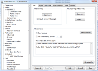
The layout of your foobar will be controlled by from the Preferences, under “Display -> Columns UI” tab. When you click on this tab, a page like the following will appear:
This is the main page of the columnsUI preferences. On the main page, you can access various tabs, which are described as follows:
-
Main - Not hugely important, but the FCS/FCL stuff is about importing and exporting layouts. You can also control the transparency of your window, choosing an alpha value between 0 (invisible) and 255 (opaque).
-
Layout - The overall shape of your foobar is controlled from here, and this page will mostly explain how to use this.
-
Status bar - This controls the bar shown at the bottom of the window, giving information such as volume, audio codec, bitrate, sample rate, etc.
-
Notification area - You can use a windows tooltip to give you track information, and this page also controls tray icon properties.
-
Filter - Ah, don’t even bother going here yet.
-
Artwork - Or here. You can get better artwork components anyway.
The sub-categories for Columns UI are “Colours and Fonts”, “Playlist switcher” and “Playlist view”, but we’ll get to those later.
Creating a layout
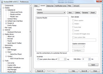
Click on the layout tab, and you’ll see something like this:
 ColumnsUI layout preferences panel
We’re going to create a simple layout, with just a playlist selector on one side of the screen, and a playlist display on the other side. The default preset should be “Default”. To create a new layout, click “New” next to the preset selector, and create a name (I’ve inventively called mine “columns”, but the name has no effect on the appearance). By default, the box displaying the layout information contains a single panel called “Columns playlist”.
ColumnsUI works by using vertical and horizontal splitters to divide up the window, and you can place panels within each section that you create. Therefore, right click on “Columns Playlist” to bring up a menu, then go to “Change base -> Splitters -> Horizontal splitter”. Then right click on the splitter, and go to “Insert panel -> Panel -> Playlist switcher”, then right click on the splitter again and go to “Inset panels -> Playlist views -> Columns playlist”. You can find item details for each item on the layout tree, just to the right. You can hide any of the panels, choose not to show the caption, etc.
Click on “Apply” and watch your foobar change! There’s no need to exit the preferences window, as you can click on anything in the main window with it still open (if you are ever worried that you’ve lost the menu, you can use Ctrl+P to bring up the preferences at any time). Your foobar will be split down the middle with your music on the right, and a playlist organiser showing one or two playlists on the left.
Using the layout
On the left, the “playlist switcher” will display any saved playlists you have, and you can add new playlists by right clicking on the panel and going to “new”. The easiest way to add tracks to a playlist is by selecting them and holding the right mouse button, then moving to the playlist and dropping the files on to it. You can also add them by right clicking on the tracks, and going to “Edit other” to find playlist tools.
You can resize splitters by hovering your mouse over the splitter boundaries, an extremely useful property. You can place panels and splitters within other splitters to get some interesting layouts.
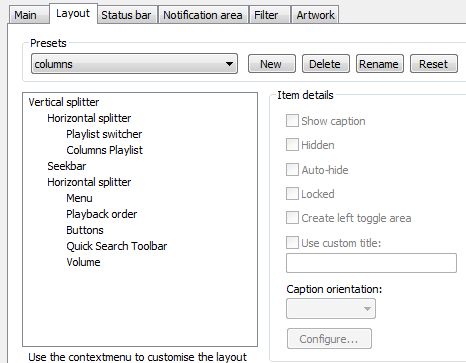
You can also move all the buttons and toolbars that are at the top of the window by default. You can do this by navigating to the Main tab of the columns UI preferences and unselecting the “show toolbars” box. Then you can place the seekbar, menu, buttons, etc. wherever you like. For example, try the following layout tree, selecting no caption for each item:
After some resizing, you will have a layout with a playlist switcher on the left, queued tracks on the right, and a seekbar plus toolbar at the bottom. Ha! We have broken the mould of programs with menus at the top.
Have a play around with the layouts, and try different combinations of panels. In the “Colours and Fonts” sub-section, you can can completely customise the… erm… colours and fonts. It’s pretty self-explanatory, so mess around with that and see what you get.
When you’ve got a set-up you can use, click “Save all” at the bottom-right of the preferences window.
In the next section, I’ll go through the steps to create an iTunes-style layout.
Next section: 5.2 Creating a ColumnsUI layout


